
This is one of two articles prepared for us by our colleague John MacLulich of Pure Colours Digital Imaging. The article is on how to adjust images in PhotoShop in order to achieve the best possible results on uncoated paper — anything from newsprint, to bond, recycled, earthy look, and expensive premium uncoated papers.
By taking on board what John lays out in the article, you can make savings by printing on uncoated paper instead of more expensive coated satin or gloss paper. High quality image reproduction on uncoated paper will enable you to stand out from the crowd, and you can give yourself more options as you consider what sort of paper stock to print you project on.
Click here to read the second article on how best to sharpen images in PhotoShop — a subject that mystifies and bamboozles most of us.
These articles assumes an intermediate to advanced level of Photoshop ability but if you consider your knowledge is more basic, then please don’t be put off reading it.
The earliest papers and boards for printing were all uncoated – made only from water and the fibres of plant materials. With the discovery, in the late 1800s, that a smooth layer of clay or similar material over the surface of the paper sheet dramatically improved the quality of the reproduction of printed images, coated papers saw a massive increase in popularity, which continues to the present day – such that coated papers are the medium of choice for many printed pieces.
Recent improvements in the manufacturing of uncoated papers have allowed much more detail to be reproduced on their surfaces, and the popularity of uncoated stocks has soared, especially among designers seeking an earthy, more ‘natural’ texture and ‘Eco’ feel for their printed projects.
However, uncoated papers still present some challenges, and care needs to be exercised when preparing artwork, especially images, for printing on uncoated media (particularly newsprint).
In these two short articles, I plan to outline methods I use when creating and preparing images for printing on uncoated stock. My methods apply more particularly to artwork being prepared for offset printing rather than for digital printing. Most digital printing methods rely on placing solid toner on the surface of the paper, and solid toner does not behave the same as liquid ink when it comes into contact with uncoated paper. The inks used by offset printing presses, web presses, letterpress or screen-printing presses, inkjet printers, or indeed the liquid toner used by Indigo digital presses, are all absorbed to varying degrees by the paper to which they are applied, rather than sitting on the surface of the paper – and this is what gives rise to the need to prepare your artwork appropriately.
Images and text printed on coated paper are usually perceived as being vibrant and sharp. The same artwork printed on uncoated paper has a well deserved reputation for looking dull, flat, and soft. However, this does not need to be the case. There is an argument that your printer should make the necessary corrections to allow for the use of uncoated paper, but my experience has been that this is not usually the case – they simply print the files you supply. So, if we want to make our designs ‘pop’ on uncoated stocks, it is up to us to prepare our artwork accordingly – particularly our images. Yes – this requires a little bit of expert knowledge, but nothing that a regular user of Photoshop should not be able to achieve.
Two aspects of your images need to be addressed – the colour, and the sharpness.
Because ink behaves so differently on the surface of uncoated paper, your images must take into account things like the dot-gain and the colour gamut associated with uncoated paper.
Dot-gain is a measure of how much the ink ‘spreads’ or is absorbed when it touches the surface of the paper. Uncoated paper has a much higher dot-gain than coated paper – as much as 30% for some newsprint papers, compared to only 5% for high-gloss art papers. A 30% dot-gain means that an image with 50% of any colour, for example Cyan, will actually look like 80% of that colour when printed – making an un-adjusted image look very dark and flat.
The colour gamut is a measure of the range of colours that can be reproduced on the particular paper and is affected by many features such as the porosity, brightness and texture of the paper. Uncoated papers typically cannot reproduce bright, saturated colours as well as coated papers, so printers use different ‘colour profiles’ to compensate for this. This allows them to make global adjustments, to do the best they can to reproduce bright colours, but they cannot adjust individual images, or rather do not have the time or expertise to do so.
Using Photoshop, it is possible to assess what your image will look like on an uncoated paper, and make some compensation for the inevitable dot-gain and the reduced colour gamut.
It is best to start with an RGB image, or Camera RAW image, as the full colour range of your digital camera or scanner is preserved. CMYK images will already have had a profile applied, which might still be embedded, and which may or may not be appropriate for the uncoated paper you are planning to print on, and which may therefore have already adversely affected the colour gamut.
Change your ‘Working CMYK’ colour space to an appropriate uncoated profile. In Australia, there are several uncoated colour profiles that could be used. The most up-to-date one is ‘PSO Uncoated v3 (FOGRA52)’, although to date few printers have adopted this profile. An older version is ‘PSO Uncoated ISO12647(ECI)’. If these profiles are not installed on your PC or Mac, you can download them here:
If you are unsure how to install a colour profile on your PC or Mac, Adobe has a simple explanation at working with color profiles.
Then go to ‘Edit / Color Settings’ on the Menu Bar. Under ‘Working Spaces’ choose the appropriate profile for ‘CMYK’. And click OK.
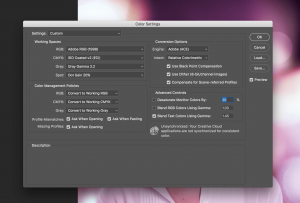
Colour Settings Dialog
Choose ‘View / Proof Setup / Custom…’ from the menu bar.
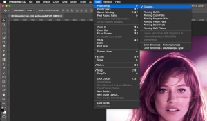
Custom Proof Setup Menu
Choose ‘Device to Simulate’ as ‘Working CMYK’ (or the Profile you chose in Step 2), ‘Rendering Intent’ as ‘Relative Colorimetric’ and check that ‘Black Point Compensation’ and ‘Simulate Paper Color’ are both ticked. Then tick the ‘Preview’box.
Immediately you tick ‘Preview’, your image will become much duller and flatter, as Photoshop is now showing what your image will look like when printed on uncoated paper.
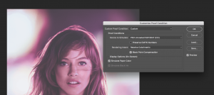
Customise Proof Conditions
Now, you can start to work on it!
I am assuming you are reasonably familiar with the colour adjustment tools in Photoshop.
There are many things you could do at this stage, to adjust your image, including:
One word of warning – the above suggestions all assume that your monitor is reasonably well calibrated. If your monitor is not colour-correct, these image adjustments may yield unexpected surprises.
When you are happy with the appearance of your image, convert it to CMYK using ‘Edit / Convert to Profile’ from the main Menu Bar, and nominate the ‘Destination Space’ as your ‘Working CMYK’ profile (the uncoated profile you chose in Step 2).
Your image will now appear to be over-saturated and will have high contrast – but don’t panic – when it is printed on uncoated paper, it should be a good match to what you might have achieved on a coated stock!
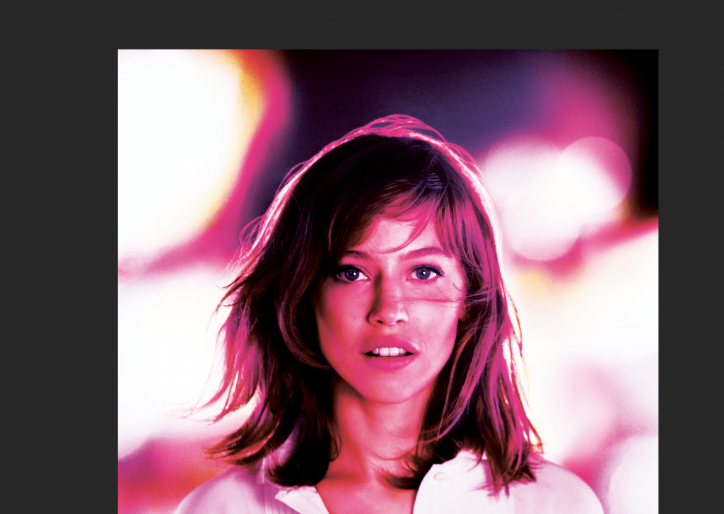
Final Converted Image
Save your image as a copy, rather than over-write the original.
Update the link to this image in your page layout programme (Indesign).
A very good video is available on YouTube, to help explain this entire process:
If you do a lot of this sort of work, and find yourself moving from coated to uncoated, to newspaper projects all the time, it is worth considering setting up different printing conditions in Adobe Bridge, and synchronising all your Creative Suite applications so that your images look the same in all programmes (Photoshop, Indesign, Illustrator, etc). Adobe has a good explanation of keeping colours consistent and a video is available below
.
In the next article, I will go through the process of sharpening your images for reproduction on uncoated paper.